Thursday, 1 May 2014

Raphael Daden

Raphael Daden is a Nottingham/UK based sculptor that works mainly with light. He developed his work by using raw lighting such as LEDs, neon and other light sources and materials.
In his lecture he spoke about several project he had done and I am going to talk about some of the projects he showed us.


Raphael Daden Light Artist Resin Metal Halide Lighting Brighton City Centre


His first commission was a series of large illuminated 'Cones' on West Street, Brighton, using pure coloured translucent polyester resins, light and steel. The three cone shaped sculptures were made to celebrate Brighton and Hove city development of the city centre, while also complimenting the surrounding architecture and sea front setting.
This is something different that would brighten up the streets of Brighton, not something your likely to see anywhere else.


This was a project called 'Painting With Light' Raph did in 2013 in Cardiff, UK made from Acrylic, Wood, LEDs, Sensor Wiring, 2m Diameter x 120mm.
Painting With Light was designed to create a blocked pattern design which would change several colours on the touch of a hand. Upto three people a time are able to touch the blocks and they would change.
The colours are made from combining different levels of red, green and blue lights generated by multicoloured LED lights. Within the structure there are a number of small programmed computers that respond to the sensing information.


Raphael - daden-Latitude-light-sculpture-acrylic-LED-light
This was a project called 'Boxed Inside' for the 2013 Latitude Arts Festival. The work was imbedded into the ground at an angle, giving the artwork the effect that these boxes had just fallen from the sky.
Raph produced several 1.3m square wooden boxes that he laser cut 15mm holes into and LED flood lights inside that shine through different coloured jells lighting up the holes.
These boxes are aesthetically appealing and it's nice they are also giving out a meaningful message. They add something different to a festival that I've personally never seen before.

''I want people to look hard and find these meaningful and heartfelt words''


Raphael Daden barking london City Council led light
Light Waves is a 2D interactive light bored built in 2006 in London, England made from stainless steel, LED lighting, perspex 20m x 2m x 150mm.
It contains thousands of LED lights in a London walkway through interaction of light colour and movement. The computer software generates a sequence in response to movement of passers by.
When pedestrians trigger the motion sensors, pulses of light from both ends on the light-board follow them to the centre activating the central circular design. The aim of the light-board is to generate a positive and popular walkway.
This idea is something that I feel would create a positive feeling as it's something interesting to see when walking through the streets of london. Something different and clever that passers by will appreciate, offering them opportunity to experience a piece of artwork.


The lecture we attended was interesting to see just what different projects Raphael took part in and the effort it took to produce the final pieces. It's something different from what we're used to seeing in the lectures, not just pictures that would be up in a gallery, but actual artwork out and about in several locations that anybody could go and view themselves.
After the lecture I was also asked to photograph him and got some nice portrait shots that I'm very pleased with and then used in my assignment. (Three images below)

Wednesday, 11 December 2013

Louise Orwin - Am i pretty or ugly?

Louise Orwin's short performance was powerful, but extremely weird. She started off dressed up as a 15 year old girl, in a blonde curly wig, with a face full of makeup & revealing clothes. She then began to mime to a Britney Spears song, which was slightly confusing, with her the camera wandering down her top, and into her mouth on several occasions. At one point many thought she was even going to put the camera up her dress which was slightly uncomfortable to watch! Once she got more into the performance it became clear that she was trying to come across as a young girl, who had done her self up for the viewers of YouTube. She came up with a number of teenage alter-egos - an emo girl called Becky, a nerdy girl called Amanda and another called Baby. In these alter-ego videos she was pretending to be teenage girls doing the craze of 'am i ugly or pretty' videos. Asking people to comment on whether they are pretty or ugly. She also went on chat websites as these alter-ego's and received many messages off many different people, including grown men. With her doing this project she has got her own statistics which she put up for the audience to see, making it more believable for the viewers, as real evidence. The production was powerful as the information she spoke about did come across in a way that made you watch and listen. You couldn't help but watch!
It was something different, and something I wasn't expecting to see. The am I pretty or ugly campaign reminded me of social networking sites such as Facebook etc. Not in a video form like Louise Orwin's performance, but in their photographs. I've seen many people post pictures of themselves in exposing manors or with extreme amounts of makeup. Girls often looking a lot older than they actually are, just to get likes on their pictures. I feel people see picture likes as being popular, the more likes you get the more popular you are. But in fact, looking at the photos that have received x amount of likes they have only achieved this by showing off more of their body and most likely being fake.

(Here is an un-edited clip of Louise Orwin I found off YouTube on the Pop Trigger show talking about her project, and the effects/issues)
http://www.youtube.com/watch?v=NrdK4diJurM

Wednesday, 13 November 2013

Amélie

Amélie is a French romantic comedy film published in 2001 directed by Jean-Pierre Jeunet. It tells the story of a young girl who craves her fathers attention, but he only touches her when giving her monthly checkups. This makes her heart beat faster, and her father assumes she's sick. She was home schooled by her mother, and her only friend was her fish Blubber. When her mother puts Blubber in the sea she gives Amélie a camera as a replacement. Her mother then dies and she us brought up by her father a lonely child. Played by Audrey Tautou Amélie becomes a shy waitress in Café des 2 Moulins in Montmartre. On 31st August 1997 Amélie is shocked by the new of the death of the Princess of wales, Dianna. Causing her to drop a glass perfume stopper, rolling across her bathroom floor and dislodges a loose tile. Behind the tile she finds a small metal box of someone's child memorabilia. On this finding, Amélie set about finding who the box belonged to, and returning it too them. Eventually she finds the owner of the box, someone who lived in her flat in the 50's as a boy and returns it to him, keeping her identity unknown. Witnessing the reaction of the now elderly man, Amélie decided to make it her life's work to make others happy. But in slightly odd ways, amusing herself and viewers. Amélie come across a  man named Nino Quincampoix, whose photo album she gets hold of when he drops it in the street. Inside Nino has reassembles peoples ripped up photo booth images, and Amélie plays a cat and mouse game with him around Paris before returning it to him. Again keeping her identity hidden. When planning to meet Nino in the café she works in she becomes too shy to reveal herself and denies her identity. Amélie spends her days making others happy,  but she isn't pursuing her own happiness, and it takes her neighbour Dufayel's insight to give her the courage to do so.
At first I was unsure on whether I was going to enjoy this film, with it all being in French, and having to read the subtitles. It started off quite strange but I did enjoy it, as odd as it was. Seeing the different things Amélie got up to was interesting to watch and sometimes quite funny. Its a film you'll only watch once.
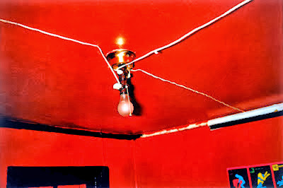
The scene of Amélie's bedroom reminds me of William Eggleston's photograph of the red ceiling, and the look of how the film was shot reminds me of the photographers Philip-Lorca Dicorcia and Gregory  Crewdson.

Friday, 8 November 2013

Seven Photographs That Changed Fashion 2008 - Rankin

We watched the Rankin documentary 'Seven photographs that changed fashion' on BBC4. In previous assignments I have researched Rankin and I'm a fan of the work he produces. Watching how he recreated seven fashion photographers work, known to be the most influential fashion images of the twentieth century, was great to see. The outcome of his work was fantastic in comparison to the original images.


 This Piece of work was originally photographed by Cecil Beaton in 1934  known as Hat Box. Rankin used the English singer Sophie Ellis Bextor in his recreation of the photograph. Many people have also tried to recreate Cecil's work but personally from the one's i have come across myself Rankin's is my favourite. Rankin used the same lighting and camera as what Cecil used when he originally took his photograph and looking at them side by side they are very similar, with Rankin having the slightly more modern look about it with the hat he used and shooting on digital
This photograph was originally taken by Herb Ritts Fred with tires 1984. Herb was a best known fashion photographer before he was out of his early twenties. The image shot was intended for an Italian designer advertising Levi Jeans, but when the clothing arrived Herb and his stylist rejected them, dressing the model in overals instead. Making the picture not what the magazine wanted. But as the image was so powerful the magazine ran them anyway causing a sensation. Rankin chose to locate the recreating shoot in a scrapyard, photoshopping the background darker so it was more like Herb's. The model Rankin used was former Dolce and Gabbana model David Gandy, and was a different experience for him as Rankin isn't used to doing this type of shoot with a male, he wasn't quite sure what to do with him. But nevertheless the image he produced was very similar to Herb's. Herb being able to connect with his models wether they be male or female. Hence the reason to Rankin's image looking more like a typical male, and Herb's being more sexual with the structure of the model, and a certain look in his eyes.


This image was originally photographed by Helmut Newton, a German-Australian photographer, 1975 Rue Aubriot in the streets of Paris, outside of his apartment. He was known to be a provocative fashion photographer. Rankin also photographed his recreation of Helmut's work in the same street of Paris at 4am, with the original model, Vibeke helping out. He chose to photograph Jade Parftitt. I personally prefer Helmut's image as the texture on the ground and the stance of the model gives the photograph a more natural feel, Rankin's image comes across more
posed.

This image was originally taken buy Guy Bourdin, a French fashion photographer, in 1970. His work is very sensual, provocative, exotic sometimes sinister. Guy was influenced by his mentor Man Ray, photographer Edward Weston, the surrealist painters Magritte and Balthus and film maker Luis Buñuel. When doing photo shoots Guy would easily take 700+ images and end up with a final one or two, and all his images were taken using lighting and a camera, no image manipulation. Personally I prefer Guy Bourdin's image to Rankin's recreation. Out of all the recreation images he took I feel this one is the least similar to the original, with the Red tights he put the model in, and the blonde/black hair. The position of Rankin's model isn't as strong as Guy's, and I prefer the look of the background in Guy's photograph that Rankin's


This Vogue cover was originally done by German photographer Erwin Blumenfeld in January 1950 (Model Jean Patchett). He began taking photo's professionally in the 1930's publishing his first work for Vogue in 1938. Here I again prefer the original photographer Erwin Blumenfeld's work to Rankin's recreation. Rankin tried to make his image more modern with the model, Heidi Klum, licking her lips, making the image a 'raunchy' version of Erwin's. He also added in her nose unlike Erwin. Although Erwin's photograph doesn't have anything more than lips and an eye it works, nobody questions where the missing features are. The recreation has been done extremely well though with the model Rankin chose looking very similar to the one Edwin Blumenfeld photographed.

This was originally photographed by Richard Avedon in 1955, he has a reputation for shooting his fashion work on location, this setting being more unusual than most, inside the famous cirque d'hiver in Paris. This image was set up intended to showcase new work by French designer Christian Dior. The model Richard used was Docima, (Her real name being Dorothy Viginia Margaret Juba). Rankin used the catwalk model Erin O'connor to recreate this image, and I prefer his to Richard Avedon's. This being because the circus elephants on Richard's photograph are chained up, looking uncomfortable as if they are trying to get away from the model. Rankin's photograph looks more relaxed. But I do like that on Richard Avedon's photograph the model is actually making contact with the elephants in the shot. Her hand on the trunk and her head leaning against one of their faces, instead on just in front of them reaching out like Rankin's


This image was taken by David Bailey originally in 1962 with the model, his girlfriend at the time, now wife, Jean Shrimpton. I feel This image is a slightly sexual, seductive image with the expression on the models face and with the pose she is doing. When I first glanced at David's photograph I thought the model's hair was in an un-do, but in actual fact he used a piece of card to give it a windswept look, revealing her neck again giving it a quite sexual seductive look. Rankin also used the card trick when recreating his image with his now wife (girlfriend at the time), model Tuuli Shipster Rankin. I prefer the work of David Bailey's compared to Rankin's due to the stance of the model on David's photograph I feel is stronger. With the arched hand on the head showing the muscles in her back, instead of it being flat as in Rankin's. It doesn't show as much detail on Rankin's models back. I also feel that on Rankin's image the dress is slightly too revealing on the models breast making it stand out. The facial expression on both of the models face is almost identical but i personally wouldn't have used a blonde model when creating this recreation image. As David Bailey chose to photograph his girlfriend and Rankin was recreating his image, this may have been the reason he chose to use his own girlfriend in this shot.

Friday, 18 October 2013

Rear Window

Rear Window film poster.jpgRear window was the American suspense crime film we watched made in 1954, directed by Alfred Hitchcock. The main character, a profesional photographer, Jeff Jefferies (James Stewart) breaks his leg photographing a racetrack, and becomes confined to his Greenwich Village apartment in a wheelchair. His rear window looks out onto a small courtyard and several other apartments, and with nothing else to do he finds himself passing time by watching his neighbours, first with binoculars, later with his camera.
While keeping watch on his neighbours Jeff Jefferies thinks he witnesses a murder, and takes it into his own hand to find more out. With him being restrict to a wheelchair, unable to actually investigate anything for himself, he informs several people of his suspicions. His home-nurse Stella (Thelma Ritter) his girlfriend Lisa Fremont (Grace Kelly) and close friend, New York City police detective, Tom Doyle (Wendell Corey)
The way the film is done is quite incredible, all being shot from inside Jeff's apartment, from his point of view and along with witnessing a murder he also looks upon suicide, broken dream and cheap death. I enjoyed this film, although it wasn't my usual choice to watch. I felt it took awhile to get into the plot, but once it got going it was an interesting film.

David Severn

David Severn is a 21 year old photographer from Nottingham, and came in to talk to us about his work. He showed us his project 'Thanks Maggie (2012)' consisting of 20 images, and each of the images he showed he could tell us a little story behind them. These two images were in his Thanks Maggie project  and are two that stood out to me.


David Coleman;
The first one of the man from the mines really stands out to me because of his eyes. Although the man in dirty his eyes look extremely clear and troubled. The story David told about this photograph was that he met the man in a cafe and they sat talking, the man told him about an explosion down the mines where a man got injured and was told he wouldn't walk or talk again. This happened to be the man he was speaking to, that he took this photo of. The expression on the mans face I feel is very powerful. This was taken on a medium format camera.


This image stands out to me more after David told us the story behind it. The man in this photograph is sat in a busy bingo hall with a beer, playing alone. David actually spoke to the man and found out that he had been coming here for years, but unfortunately his wife had recently died and this was a something they did together, so he keeps up the tradition of going to play bingo, alone. Once you know the story of this image I think it allows you to appreciate it more, as you can see straight away that the man looks sad and lonely, and now you know why. I feel this image has questions popping up in my head after knowing the story behind it. Why is this man sat alone in such a busy hall? Does he want to be alone? How is he feeling? Is he alone every time he comes here? - The image is a very powerful image alone, without actually knowing the background of this man. It isn't forced or set up, and with the old man being the only person in focus in such a busy hall you can help but keep looking at him.

Thursday, 17 October 2013

The Colourful William Eggleston

William Eggleston is a 70 year old self taught American photographer, who is still taking adventurous pictures, in and around his hometown. His passion for photography began when he had his first camera at 18. When asked what he photographs William replied 'life today,' and photographed  'the ugly stuff' The photographs rarely ever have titles and he only ever takes one pictures of one thing. All the film images he printed himself and none of his photographs were ever forced, often invading peoples private space with his camera. So gently they don't always realise. His images were often cut off, giving them the feel of having something missing.
Alot of his experimental work was done on his children from a young age, where he would get them up early and make them stand for hours for his photographic purposes. William has a very different eye for things, seeing photo possibilities that not all would appreciate. 'Never take an image for granted' He was said to simply photograph nothing and claims it to be a picture, making it interesting.
In 1960 William Eggleston shot his first colour film, and it took a long time for people to appreciate his work as it wasn't something they were used to. He was also the first photographer to print none commercial images. In the early 70's a museum published Williams first colour book of his images 'William Eggleston's Guide'
This image is one of his famous photographs 'The Red Ceiling,' William considered it among his most challenging and powerful pieces, red being a difficult colour to work with. The walls are blood red, and still look wet in this photograph.
The term 'edit' didn't cross Williams mind and all of his work tells a story of his life/day. In May 1976 he has a show of his work which when reviewed people claimed it to be boring, simply because they just didn't understand it, or it was something new/different, but they later apologised. His work is now displayed all over the world in galleries and used in fashion, music and films.